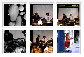
A few people have been asking about how I style the images in the sidebar and I’ve been lazy in replying. Basically, we just need a list of images and then apply a few css style to it.
For the flickrRSS crowd, go into the options panel and set before image to <li> and after image to </li>. In your sidebar code/template/whatever wrap your flickrRSS function in a list. We also want to add a <div> so we can style the list. It will end up looking something like this:
<div id="flickr">

 <ul><?php get_flickrrss(); ?></ul>

 </div>
That’s it on the html front. It’s the styling that’s left. There are two essential things that we want to do, remove the bullets and remove the breaks. These two bits of css should take care of that:
#flickr ul { list-style: none; }

 #flickr ul li { display: inline; }
Everything beyond that is gravy. Personally, I take all the margins and padding off the list and then style the images with a thing border and a bit of padding. My code looks something along the lines of:
#flickr ul, #flickr ul li { padding: 0; margin: 0; border: 0; }

 #flickr a img { border: 1px #ccc solid; padding: 3px; margin: 5px 3px 0px; }

 #flickr a:hover img { border: 1px #999 solid; }
That’s pretty much it. You could start doing fancy things like backgrounds, fading the picture on hover, etc. But we’ll leave that as an exercise in Google research. There may be better ways to do it, you’re welcome to comment.

