

The last month or so has been an interesting one for the site. I started the redesign about a month ago and it’s still going strong. This time around, it’s not just about looks, most of my efforts have been concerned with structure; thinking about how people visit the site and ways to keep them around. It’s not easy. If you’re really interested, read the change log. The site will never be finished but this layout should stabilize within the next few weeks, I still haven’t figured out how Michael is actually quantifying his progress.
Despite my best efforts at becoming a structural whore, eightface has managed to pop-up on the radar of a few CSS gallery sites — most notably, CSS Beauty, Design Shack and Fadtastic. So, hello to all the new visitors and thanks for the constructive comments and feedback. I’ve made a few changes a result, namely toning down the grunge on some of the headers.
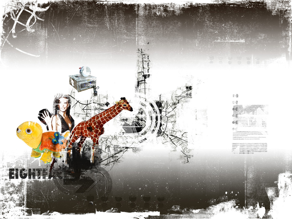
A few people have mentioned their love/hate of the grunge stylings. I’m inclined to agree that a lot of the grunge and erasure sites popping up are a direct response to the austere 37 Signals school of design that we see so much of these days. And yes, it is a fad. One of those things that floats across the internet every few years. Usually in response to an outpouring of corporate work and people wanting to do different things with their personal sites. The vintage, worn look is very forgiving and has been one of my staples since the days of Photoshop 4 on the family P90.
