
Want to get lost in the world of information? The NYT’s cybertimes navigator has enough internet sources to give you limitless reading material. Although, it’s one of those things in desperate need of a shortened url.
The Web is Like Canada
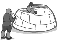
Five and a half years later, and Joe Clark’s The Web is Like Canada still rings true — chiefly, that the web may be best defined by what it is not.
For those unfamiliar with the conundrum of Canadian identity: we have an abundance of iconic symbols, but lack a set of generic traits to pigeonhole the populace. We are everyone, and we are no one. The online world isn’t much different. It endures a constant battle of redefinition, with no real end.
Where’s the beaver?
The first generation of buzzwords are now just a distant memory — convergence, portals and push. They’re the inbred cousins that you locked in a shed and forgot about. Yet, they still managed to pop out a couple of bastard children — AJAX, community and web 2.0. Just remember that most of it doesn’t mean anything to real people:
Among the crowd that actually runs Web “properties”, there are no alternatives, a lack that masquerades as a “standard”. Their Web is Starbucks; it is the three American broadcast networks before cable TV; it is a single-newspaper town. Their Web is Pleasantville before colourization. It is mainstream in the worst possible sense.
I’m not saying there’s a problem with the stupid nature of Vocabulary 2.0, language issues are part of what makes Canada great. We just need to make sure everyone is on the same page.
Democrazy served cold
Startups are not new, neither is building to flip. A business has parallels to constructing a nation, but we need to remember that nation-building on a whim is going to give us trouble.
We old-timers wonder why the oligarchs are throwing so much money down the tubes in an effort to overthrow the existing Web. We believe in a certain kind of Internet, one that’s open to new ideas but not open to every cockamamie idea.
We’ve been down this road before, and we’ll be down it again. So, heed Joe’s words and let your voice be heard:
What I want to happen is for the wise elders of the Web, those of us who’ve been online forever and really do know better than the neophytes, to use the concepts derived from the perpetual struggle to define Canadian identity as an arrow in our quiver in efforts to shoot bad ideas out of the sky.
Blam blam. Arrowed.
Worldmapper
Information representation is always a fun exercise. Worldmapper takes it to an extreme, showing what the global map looks like under various statistical weightings. Aircraft travel vs rail travel.
Fun with money
flickrRSS 3.0.2
Fighting Blog Depression
Does reblogging a months-old post concerning a 6-page pamphlet detailing what you need to know about blog depression serve as a good kick in the teeth?
Hey, I’m not old
Seems like no one wants to grow up these days. Up With Grups takes a look at a new breed of thirty-somethings that hate the man. That’s cool, we’re glad you old farts like our music. But if you guys come to our rocks shows, please stay in the back, so we don’t trip over your canes.
JTF2 WTF?!?
Canada has an elite military unit on par with Delta Force and SAS, dubbed Joint Task Force 2. They were part of the coalition operation in Afghanistan and apparently they’ve been operating in Iraq. According to the PM, they’ve been there the whole time. And here I was thinking we weren’t supposed to be involved with this shit.
Printable lens hoods
Check out these lens hood templates that can be cut out and mounted on your camera, thereby saving you many dollars. Although, you might want to pick up some dark card stock, so you don’t look like a tool.
5Q with Matt Brett
Matt Brett sits down for five questions with Seal Club. This event has literally been months in the making. Why? We’re lazy.
Skinny Corp
For some reason, I had never seen the Skinny Corp site until tonight. They have some awesome cut-n-paste style collage action going on. It’s kind of similar to my original idea for the Olympia theme, glad I didn’t roll with it.
This is Olympia pt i

It’s about a week into the redesign of Eightface and things seem to be going okay. It’s taking a bit longer than usual — the home page and post pages are coming together nicely, but the rest of the site is lagging pretty far behind. For now we’ll stick to the impetus for the change and some thoughts about structure, while saving the methodology for a later post.
Dude, where’s the grunge?
Grunge is easy for me, it’s very forgiving. I needed something different, something cleaner and a bit more challenging. So far it’s very clean, there are almost no graphics in the css file other than the odd icon. I’m also making an effort to do a decent job in terms of accessibility, but I need to do more reading. Also, it probably looks like ass in IE right now.
If you like the dirty stuff, don’t despair. I’m currently in the process of releasing my last three layouts as theme packs. There should be more desktop wallpaper in the future too.
Bye-bye single column
A couple months ago, I thought that integrating the posts and quickposts would induce me to write more often. It had the opposite effect, the quickposts became more like long posts, the links ended up in my delicious stream and I had trouble finishing any of the templates. After most of the content on the front-page drops below the fold, you forget about it — out of sight, out of mind.
I’m not saying that the one-column structure can’t work, but it was having a negative impact on my posting style. If you’re looking for one-column inspiration: Michael did a good job with invader and Justin’s minimalist look is awesome. As for me, it’s off to the greener pastures of a one-glance tabloid style homepage.
The single column integrated structure won’t disappear completely, it’ll be put to use for the monthly archive view, as well as a log view for those that like their integrated feed style reading. Although that main central column will have two outliers to display date and comment count.
Hello sexy grid

Hopefully, the print influences in the design are obvious — you never know. I’ve always had a hard-on for black and white. Back in grade eight, I organized a team of five people and co-opted the school newsletter from the Vice-Principal. The first issue was a cut-and-paste nightmare, after that Microsoft Publisher 2.0 was my bitch.
Over the last week, I’ve spent a good chunk of time with my site open and copy of the Globe and Mail in front of me. The print edition has nice red accents, and thick black bars over allcaps in some sub-sections. Beyond that, Subtraction and Coudal have been the primary web influences for visual style and structure.
In terms of creating a proper grid structure, I don’t profess to know anything, so I’ll leave it to others. Mark Boulton’s simple steps to designing grids is a good place to start. Khoi offers up a nice technique to display a grid under your content. (you may have seen mine appear over the last few days). Adhering to the structure is a bit of a pain, but it works well visually.
The plan
We could call this a live redesign, or a live realign, but it probably sits somewhere in between. So, please bear with the ugliness while I get things sorted. A lot of the work I’ll be doing is actualizing things I wanted to have done with the last theme. The nitpicky bits: local searches, posting all my artwork again, going back through old posts to redo them, better subpages (links, archives), etc.
My priorities have been getting the home page and single post views in functional condition (some stuff is still missing). Next up are the search, page and monthly archive views (which should all be relatively similar). After that comes a few new additions, including a help/faq page and a more box on individual posts (to drive those ariving via deep link further into the site) and a forum of sorts, so I can provide better support for the various WordPress plugins and themes. And updates to the plugins of course. A lot of the subpages need work before I make the links to them obvious. All in all, the current implementation of the site is far from finished but the most trafficked portions are in decent shape.
That’s it for now. I’ll spend more time exploring the method behind the madness at a later juncture. To find out what’s going on with the site, check the changelog. If you’ve got ideas or suggestions, let me know.