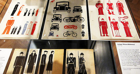
If you missed the Isotype exhibit (more) at the V&A, no need to worry. Jasso posted a set of photos from out visit in December. You may also be interested in The Transformer by Marie Neurath and Robin Kinross.
I make things on the internet

If you missed the Isotype exhibit (more) at the V&A, no need to worry. Jasso posted a set of photos from out visit in December. You may also be interested in The Transformer by Marie Neurath and Robin Kinross.
Protovis is a free and open-source graphical toolkit for visualization. It uses JavaScript and SVG for native visualizations in a web browser. Michael used it to analyze the traffic from his Chewbacca post.
A visualization of the American soft drinks industry. Despite the apparent abundance of choice, three firms control 89% of the market.
Flip Flop Fly Ball features loads of baseball related infographics. The game is a statistician’s wetdream and accordingly, makes for some great visuals.
An awesome infographic on 50 years of space exploration from National Geographic, although they’re using a kludgey flash viewport. Check out the full size version while it lasts.
Update: If you like that one, check out this visualization of the various mars missions.
Information is Beautiful has a number of cool information visualizations posted on their site. I particularly like the timeline of global media scare stories.
Periodic table of controllers. An interesting infographic of video game controllers, would be bit cooler if it mimicked the structure of the periodic table a bit better.
GOOD Magazine keeps an archive of all the information graphics used in their articles. Seems like a good place to visit when I need a little inspiration.
Jeffrey Veen’s presentation on designing for big data. A quick peek into the history of data visualization, how we’re changing from consumers into participants, and how technology has allowed huge amounts of information to be recorded, stored, and analyzed. Personally, I’m just starting to get my feet wet with processing.org and will need to setup some sort of venue to display my experiments.
Many Eyes is a project from IBM that seeks to “democratize” visualization and create a social kind of data analysis. Upload your own data set or use one of the theirs to create a variety of different visualizations.
A review of The Wayfinding Handbook. I’d like to see a copy before buying, but it looks like a good addition to the collection.