NYC’s New Maps Orient You Like A GPS
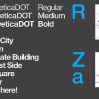
Monotype created a new version of Helvetica (famously used in NYC’s subway stops) called Neue Helvetica DOT. Its most easily noted distinction would be its rounded dot, an obvious play on words that references the fact that Helvetica’s dots are usually squares. From this typeface, Pentagram created a set of icons for services like bathrooms, hospitals, and transportation, mirroring curves in the lettering to construct the images.

