
Montreal’s STM is updating their signage (more info), with a focus on wayfinding and legibility. They’re shifting the typography from Univers 57 to Transit, as well as implementing a custom monospace and pictogram fonts.
Tag: typography
My font was in a movie
My font, Plastic Tomato, appeared briefly in Despicable Me 3.
I get a huge kick out of this, mostly because I made it twenty years ago while I was still in high-school. Grunge design was popular and there was an indie font scene happening on the early web. I churned out a bunch of fonts over the span of a year or two, released them all online, but didn’t take it much further. They managed to make it through several site migrations, and are still tucked away in the dusty type section of the site.
All of the fonts were freely available and had a note attached saying to get in touch if you want to use them commercially. I still get the occasional email, mostly people using them for smaller personal projects. So, I was a bit surprised to get a message from a movie studio asking for clearance to use it.
I wanted to reach out because I’m working on Despicable Me 3 and production is interested in using your Plastic Tomato font for a 1980’s style action figure commercial in the movie. The font would be seen on screen (along with other fonts) stating the action figure’s features. If you’re okay with the use, we’d appreciate it if you could sign the attached clearance request.
I signed the request, but wasn’t sure if it would actually make it into the movie. Never got around to seeing it in the theatre, but grabbed a copy when it was released digitally.
And there it is, the font I made in high-school, on-screen (gif) for approximately two seconds!
NYC’s New Maps Orient You Like A GPS Monotype created
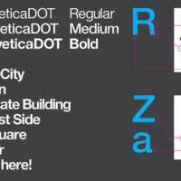
NYC’s New Maps Orient You Like A GPS
Monotype created a new version of Helvetica (famously used in NYC’s subway stops) called Neue Helvetica DOT. Its most easily noted distinction would be its rounded dot, an obvious play on words that references the fact that Helvetica’s dots are usually squares. From this typeface, Pentagram created a set of icons for services like bathrooms, hospitals, and transportation, mirroring curves in the lettering to construct the images.
Vignelli on the AA logo redesign
American Airlines recently reworked their classic logo. Massimo Vignelli, designer of the original, commented on the the original intention of the design.
Legibility, which is a very important element of an airplane. So we used Helvetica, which was brand new at the time. And we wanted to make one word of American Airlines, half red and half blue. What could be more American than that? And there were no other logos then that were two colors of the same word. We took the space away, made one word, and split it again by color. It looked great. The typeface was great. We proceeded by logic, not emotion. Not trends and fashions.
Bauhaus Dessau identity

I’m a fan of the new identity for Bauhaus Dessau, created by HORT.
We thought a generic design would work best in order to make this distinction. The new identity was created by using strict typography, a minimalist layout, standardised formats and no colour. Being the most generic and incidental typeface, Courier was selected as the new corporate font. To guarantee a unique identity we changed the capital “A” of Courier according to Herbert Bayer’s well-known logo on the front of the Bauhaus Dessau building.
The identity also makes use of Arial, presumably due to its prevalence on most machines.
Photo-Lettering
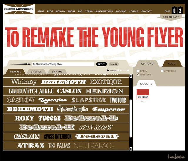
Photo-Lettering from House Industries allows you to easily set headlines and download scalable vector files of the results. The service is relatively inexpensive and will be well suited to projects that need some quick custom lettering. If you don’t know anything about photo-lettering, take some time to go through the history section of the site.
Unicode video
If you ever wondered what it would be like to sit through a video of 49571 unicode characters, now’s your chance.
Comic Serif

Rob Mientjes adds serifs to the typeface that everyone loves to hate, giving us Comic Serif, complete with swashy Q. Why not? This one is more in keeping with the original typeface than the version I mentioned a couple years ago.
Open source ampersands
A selection of open source ampersands for use in web design. The ampersands have been packaged up into one characters in a webfont format. The site was inspired by Dan Cederholm’s article about using the best available ampersand.
One space after a period
Despite whatever you’ve been told in the past, you should only put one space after a period, not two.
Is this arbitrary? Sure it is. But so are a lot of our conventions for writing. It’s arbitrary that we write shop instead of shoppe, or phone instead of fone, or that we use ! to emphasize a sentence rather than %. We adopted these standards because practitioners of publishing—writers, editors, typographers, and others—settled on them after decades of experience. Among their rules was that we should use one space after a period instead of two—so that’s how we should do it.
In my high-school typing class, we were working on ancient ICON computers which used monospace type, and were told to leave two spaces after a period for readability. I then spent years developing muscle-memory that had me double-tapping the spacebar after every full-stop. In university, I started writing for one of the newspapers and got yelled at for putting in double spaces and messing up the copy-setting — I learned quick. Fast-forward to book design, and given any sort of manuscript, getting rid of the double spaces is one of the first priorities. Remember, just one space.
Selling old typefaces
An interesting thread on Typophile concerning whether or not you can digitize and old font and sell it by its old name. The thread devolves in true internet fashion, but worth taking a read through if you’ve ever considered remaking an old typeface.
MoMA adds typefaces to collection
The MoMA has added new typefaces to its permanent collection, including: OCR-A, FF Meta, FF DIN, Verdana and Gotham.
This first selection of 23 typefaces represent a new branch in our collection tree. They are all digital or designed with a foresight of the scope of the digital revolution, and they all significantly respond to the technological advancements occurring in the second half of the twentieth century. Each is a milestone in the history of typography.
The site lists all of the typefaces and the reasoning behind the selections.