Skip under construction message
Under construction

Under Construction

Building in public 👉 github repo / changelog

Old man look at my life

From an interview with Rob Weychert:

If you think of the two media as people, print is a wise old man who is set in his ways, whereas the web is still a child, unformed and full of potential.

The web is about to turn 16 next month, wherein it will come to the conclusion that no one understands it and everyone sucks. It will then proceed to dress entirely in black, listen to angsty music and write bad poetry.


MacBook harddrive failure

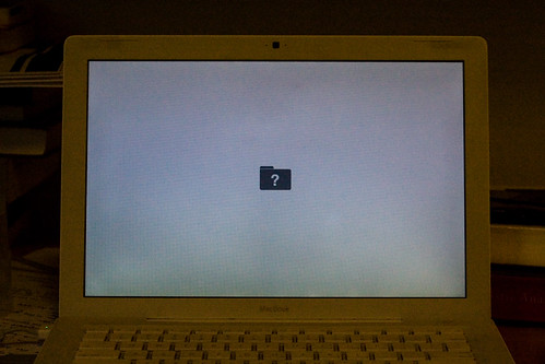
The harddrive in my MacBook decided to die on Saturday afternoon. Wasn’t doing much — had a few programs open and was in the process of checking out some books from the British Library. Tried to load up some bibliographic software, got the spinning beachball and most of the programs locked up. So, I did a hard reboot. After turning it back on, I received a grey screen with a blinking folder containing a question mark.

Macbook harddrive failure

It would have been nice if it was some sort of minor system glitch, but the harddrive is making that ticking death-rattle. Apparently, this kind of failture seems to be a somewhat common problem with MacBook users. The laptop is still under warranty for another month, so I should be able to get a free replacement. Although, there is the problem of the sales receipt being physically located in Canada. I have a Genius Bar appointment Monday morning at the London store, hopefully all goes well.

I had a complete system backup from a few weeks ago, so I’ve only lost two week’s worth of dissertation research. It could have been much worse. My computer is currently operating via the backup on my external drive. SuperDuper is a godsend and is well worth the expense, it allowed me to make a bootable clone of my harddrive. Senuti is also a handy little utility if you want to retrieve music from your ipod.

Let this be a warning to all of my fellow masters students (and everyone in general), make sure you have reliable backups. At least it happened now and not in two months when the dissertation is due.

Update: The Apple Store was willing to replace my harddrive, but I would’ve had to leave the laptop with them for 3-10 days because they didn’t have any 60gb drives in stock. Couldn’t really afford to be without my machine for that length of time, so I decided to replace the harddisk myself.

I picked up a Hitachi Travelstar 160gb drive, installed it in about 15 minutes, and restored from the three-week-old full backup. Everything is up and running again, but I’m now completely paranoid. In the process of making sure that I have copes of photos, music and school files on my web host.


Yet another last minute post

It’s becoming a bad-habit to write an entry at the end of the month — just to make sure there’s one full-size journal article for the monthly archives. As usual, there’s a slew of excuses for my poor performance (final project displays, flat-hunting in London), but they’re not entirely valid given the host of busy people that are more prolific posters. Not that quantity necessarily equals quality, but nothing is kind of pathetic.

The reality is that I just haven’t been taking an active role in my own website for the last year or two. It hasn’t been part of my life in the same manner that it was. Eightface used to be more personal, a digital playground of sorts. But somewhere along the line, it changed. I stopped offering my opinion, I stopped being funny, so it stopped being fun. The site became a giant sanitised turd, if such a thing can exist.

Anyway, that’s enough ripping into myself for poor performance. I’m off to a goodbye party for Marvin, he’s heading back to Canada in a few days. He’ll be getting married later this month, and I wish him all the best.

I’m working on a new design/layout for the site, that should be finished in the near future. It’s actually happening behind the scenes, and is a little bit more involved than my typical ‘live’ redesign. Keep an eye out for the announcement.


75km in four weeks

Started running/jogging again a month or so ago. The primary reason was to get myself in better shape (increased stamina, energy, etc.). Combined with an active effort to eat better, it’s making a difference. I can run further/faster than before and I’ve dropped a little over ten pounds in the last five weeks — that’s like strapping a good four or five bags of sugar to my gut.

The Nike + iPod thing makes the whole experience relatively easy, essentially turning physical activity into a video game. About a month ago, I set a goal to run 75km in four weeks, something that seemed almost impossible at the time. Anyway, it happened and didn’t kill me too much. Here’s proof that I achieved my goal, as well as my run from earlier today:

75km in 4 weeks

3.34km in 22mins

I’m not on the road to becoming one of those crazy health nuts, but it does feel good to get the heart rate up. As far as eating better goes, it’s mostly trying to avoid snacking. Well, that and fast/pre-packaged food — it can be so easy to eat terribly in the UK. Overall, I’m feeling heathier and better.


Design Can Change

Design Can Change

The folks at smashLAB and ideasonideas have started a new initiative called Design Can Change. The flash presentation focuses on the impact that designers have on the environment and their role in sustainable development. It’s primarily targeted at print designers because they have the largest ecological footprint… think pollution from the pulp and paper industry.

As a book design student, I’ve done a lot of printing over the last six months and am probably responsible for the destruction of a small forest. It’s hard to avoid, things just don’t look right on-screen. I’m almost ashamed to admit that our typography department didn’t even recycle waste paper until about a month ago. Seeing bins full of paper trimmings every night was kind of depressing.

The presentation will take some time to go through, it’s not overly short. The interface is a little bit awkward, but I’m not overly fond of websites that are completly constructed in Flash. They also seem to be focused on the North American market, it would be nice to get a list of eco-friendly European paper suppliers.

You can read more about the development and impetus for the project at ideasonideas. It’s also worth giving 1000 Words: A Manifesto for Sustainability in Design (at Core77) a quick read.


Back from Italy

Forum Panorama

Just starting to decompress after the end of the semester and a whirlwind typography department tour of Rome and Florence. I’ve started to go through my photos, but need to clear up some harddrive space to get at some of them. There are a few posted in my Italy 2007 set on Flickr, including a full-res version of the above panorama from the forum, but it’ll will still be a little while before the rest go up. I’m also frustrated with iPhoto, and will likely switch over to managing my photos manually in combination with Lightroom.

In the meantime, some of the other students have started to post photos. First and foremost, check out Chris Hill-Scott’s photos of Rome and Florence. He’s a great photographer and managed to take some amazing shots, despite having course-work to do as an undergrad. Flickr is serving as the defacto post-grad repository, so far we have photos from Alice, Dan, Hans, Jasso and Jenni.


Off to Italy for a week

I’m off to the continent for a week, so there won’t be any posts for the next week or so (not that anyone would notice). I intended to a better job posting this month, but ended up bogged down with school-work. There were many a long night spent in the department during the last few weeks. The project was a lot of fun though — working with John Morgan, designing a hypothetical book series. We spent a day in London with Derek Birdsall, having an extended lunch with altogether too much wine. That project was topped off with a three-thousand word paper for an experiment that we had to design.

The trip to Italy is offered through the typography department. Technically, it’s an undergrad course, although it’s predominantly post-grad these days. Upon my return, there will be many nerdy typography related photos, and many of the more general variety. I will attempt to post some updates via my twitter account, provided my phone functions properly. See you on the other side.


Typography Department Namedrop

I’m currently knee-deep in the latest project at school — designing a complete system for a line of paperbacks, hardcover books and a magazine (including the covers, interior type treatment, etc, etc). On that note, Arctic Paper is amazing; they delivered dummies and sample paper inside of 48 hours.

These days, it feels like the typography department is my second home. Here’s a quick run-down of the other people at school with an online presence, most of them are in type design:

Tim Ahrens
David BÃ…â„¢ezina
Gerben Dollen
Nicole Dotin
Marvin Harder
Rob Keller
Jasso Lamberg
Ian Moore
Dan Rhatigan
Alice Savoie
Fernando Vargas

If I’ve left anyone out, drop me a line or punch me in the hallway. And now I should stop procrastinating.


Grids, grids, grids

I’m currently knee-deep in research concerning the use of grid systems in design. Specifically, whether their role is paramount to the content or if it’s more subservient in nature.

Essay research

A bit of light reading (from top to bottom):

Links will be added when I need to procrastinate a bit more.


flickrRSS 3.1.2

Updated the flickrRSS plugin for WordPress. Flickr altered the urls for static photos. It affects those using the image cache. If you want to fix the plugin yourself, open flickrrss.php and find the following line:

68: preg_match('<http ://static.flickr.com/d+?/([^.]*).jpg>', $imgurl, $flickrSlugMatches);

and alter the code, so that it reads:

68: preg_match('<http ://farm[0-9]{0,3}.static.flickr.com/d+?/([^.]*).jpg>', $imgurl, $flickrSlugMatches);

Thanks to jrsmith for the fix.


All your kern are belong to us

This was originally posted at Helveti.ca on August 6th, 2006. I removed it to keep the focus on helvetica related news.

Letraset

There’s something to be said for lusting after beautiful type. You’d be hard-pressed to find a designer that doesn’t have an unhealthy obsession with letterforms. As to what causes this affliction, it’s difficult to say. For some it was that overbearing professor in college, while others were bitching out their pre-school teachers for not properly kerning the flashcards.

My earliest experiences with typography were somewhat illicit. In the pre-PC days, my mom used Letraset transfers to avoid doing lettering work by hand. Of course, those sheets of characters were completely off-limits to me — in kidspeak that means I had to have them. There’s also something intensely gratifying about rubbing a sheet of wax paper and having fully formed letters appear on the paper below.

Schooled

Microsoft Publisher 2.0

Further typographic growth was largely stunted until my exposure to the world of electronic publishing. In my last year of elementary school, I co-opted the newsletter from the Vice-Principal and organized a team of students to run it. The first issue ended up being a collage-style photocopy monstrosity. Three months later, Microsoft Publisher 2.0 was our bitch… justified text, clipart, you name it.

In high-school, it was more of the same. A couple of teacher’s strikes plus work-to-rule, left a small cabal of punks in charge of the school yearbook rather than the usual club. It was my first print-shop experience, we worked with a local outfit rather than a national organization. The end result consisted of two dirty grunge yearbooks designed in Photoshop.

University brought four more years of education and yet another publication take over. In the final year of my compsci degree, I ended up editing one of two large campus newspapers — Golden Words, the engineering society’s humour rag. Over my four years, I watched it progress from layout with wax and flats to a full-fledged Adobe CS workflow. The production process was daunting, but fun. We usually started around noon on Sunday and ended in the wee hours of Monday morning, whenever the paper was finished.

Developed

Sound of Print

We bought our first family computer when I was in high-school. About a year later came dial-up, with its seedy underworld of Z’s and pirated software. The purchase of a spiffy cd-r, thrust me into the world of Photoshop, and weird Streamline-Illustrator-Fontographer workflows.

Around the time I was starting to screw around with the ill-gotten software, Swanky.org was hitting it’s heyday. For the uninitiated, Swanky was the ubercool collective of young designers, writers and typographers that everyone wanted to be part of. It was home to a variety of projects, including the Sound of Print and Final. Swanky ended up collapsing before I had the chops to become part of the Swankarmy. That said, the site had a large influence on my early artwork and motivated me to create a number of typefaces.

After the collapse of Swanky, I hooked up with another art group that formed in its wake at Suffocate.org. We produced regular theme-based issues, as well as a variety of side-projects. It exposed me to a lot of great artists and people who had a much better grasp of typographic principles.

Resigned

At some point, I began to realize how much effort and work was involved in creating a usable typeface. To produce my crappy fonts, it generally took at least a couple days of good solid labour. I joined the crew at Fontmonster to distribute my creations, but it made me feel like a bit of a hack. So, I gave up on producing any typefaces until I had the time to do it properly. All-in-all, I have the utmost respect for typographers and can understand why they spend months, if not years, on a single character.


One project down

Just finished up my first project for the book design course, after spending many a late night at the department. We were tasked with laying out the first book from the Kamasutra (it has seven books). The first book is mostly concerned with the contents of the other seven, so it’s not particularly spicy. We also had three commentaries to fit in there, including commentary on commentary. So, it was in need of an academic treatment, rather than the dirty picture book that you’re probably envisioning.

The book managed to come out at an even 32 pages, which makes for a nice signature with simple binding. Anyway, it’s finished and I’m happy with final product for now. It’s about 1:00 in the morning, and I’m ready to crash (the post is back-dated to sneak in under the October banner). Here are a few photos:

Book Design Project 1: The Kamasutra

Book Design Project 1: The Kamasutra

Book Design Project 1: The Kamasutra

Book Design Project 1: The Kamasutra

Just to note: the paper is white, the photos were taken late this evening without a flash and with little care.