Skip under construction message
Under construction

Under Construction

Building in public 👉 github repo / changelog

All your kern are belong to us

This was originally posted at Helveti.ca on August 6th, 2006. I removed it to keep the focus on helvetica related news.

Letraset

There’s something to be said for lusting after beautiful type. You’d be hard-pressed to find a designer that doesn’t have an unhealthy obsession with letterforms. As to what causes this affliction, it’s difficult to say. For some it was that overbearing professor in college, while others were bitching out their pre-school teachers for not properly kerning the flashcards.

My earliest experiences with typography were somewhat illicit. In the pre-PC days, my mom used Letraset transfers to avoid doing lettering work by hand. Of course, those sheets of characters were completely off-limits to me — in kidspeak that means I had to have them. There’s also something intensely gratifying about rubbing a sheet of wax paper and having fully formed letters appear on the paper below.

Schooled

Microsoft Publisher 2.0

Further typographic growth was largely stunted until my exposure to the world of electronic publishing. In my last year of elementary school, I co-opted the newsletter from the Vice-Principal and organized a team of students to run it. The first issue ended up being a collage-style photocopy monstrosity. Three months later, Microsoft Publisher 2.0 was our bitch… justified text, clipart, you name it.

In high-school, it was more of the same. A couple of teacher’s strikes plus work-to-rule, left a small cabal of punks in charge of the school yearbook rather than the usual club. It was my first print-shop experience, we worked with a local outfit rather than a national organization. The end result consisted of two dirty grunge yearbooks designed in Photoshop.

University brought four more years of education and yet another publication take over. In the final year of my compsci degree, I ended up editing one of two large campus newspapers — Golden Words, the engineering society’s humour rag. Over my four years, I watched it progress from layout with wax and flats to a full-fledged Adobe CS workflow. The production process was daunting, but fun. We usually started around noon on Sunday and ended in the wee hours of Monday morning, whenever the paper was finished.

Developed

Sound of Print

We bought our first family computer when I was in high-school. About a year later came dial-up, with its seedy underworld of Z’s and pirated software. The purchase of a spiffy cd-r, thrust me into the world of Photoshop, and weird Streamline-Illustrator-Fontographer workflows.

Around the time I was starting to screw around with the ill-gotten software, Swanky.org was hitting it’s heyday. For the uninitiated, Swanky was the ubercool collective of young designers, writers and typographers that everyone wanted to be part of. It was home to a variety of projects, including the Sound of Print and Final. Swanky ended up collapsing before I had the chops to become part of the Swankarmy. That said, the site had a large influence on my early artwork and motivated me to create a number of typefaces.

After the collapse of Swanky, I hooked up with another art group that formed in its wake at Suffocate.org. We produced regular theme-based issues, as well as a variety of side-projects. It exposed me to a lot of great artists and people who had a much better grasp of typographic principles.

Resigned

At some point, I began to realize how much effort and work was involved in creating a usable typeface. To produce my crappy fonts, it generally took at least a couple days of good solid labour. I joined the crew at Fontmonster to distribute my creations, but it made me feel like a bit of a hack. So, I gave up on producing any typefaces until I had the time to do it properly. All-in-all, I have the utmost respect for typographers and can understand why they spend months, if not years, on a single character.


One project down

Just finished up my first project for the book design course, after spending many a late night at the department. We were tasked with laying out the first book from the Kamasutra (it has seven books). The first book is mostly concerned with the contents of the other seven, so it’s not particularly spicy. We also had three commentaries to fit in there, including commentary on commentary. So, it was in need of an academic treatment, rather than the dirty picture book that you’re probably envisioning.

The book managed to come out at an even 32 pages, which makes for a nice signature with simple binding. Anyway, it’s finished and I’m happy with final product for now. It’s about 1:00 in the morning, and I’m ready to crash (the post is back-dated to sneak in under the October banner). Here are a few photos:

Book Design Project 1: The Kamasutra

Book Design Project 1: The Kamasutra

Book Design Project 1: The Kamasutra

Book Design Project 1: The Kamasutra

Just to note: the paper is white, the photos were taken late this evening without a flash and with little care.


Hello Goodbye

It’s been a busy month for me, and probably the worst one on record for the history of eightface, at least in terms of regular posts. But for once, I actually have a decent excuse: I’m starting an MA in Book Design at the University of Reading inside of the week. The school has an amazing typography department and I’m honoured to be a part of it.

You can look forward to a good deal of design and typography related material on the site, but it might be a little while still, at least until I get settled. Currently, I don’t actually have a place to live… my application was a tad on the late side, so I’m lucky to even be at the school. To the Brits out there looking for a pint, drop me a line via email and I can give you my cell number.


flickrRSS 3.1

The flickrRSS plugin for WordPress has been updated — download.

The primary reason for the update is to reflect the new Flickr feed addresses. Most personal feeds are unaffected by the change, but it broke the group pool feeds (they used a different URL structure). Flickr has also beefed up the number of pictures in the feed, so the plugin can now display up to 20 recent images.


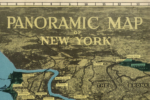
Panoramic Map of New York

Panoramic Map of New York City, title section
Panoramic Map of New York City, midtown section

Map Cover: large | flickr
Map Front: small | large | flickr

Picked this map up a few months ago at a used bookstore, but kept forgetting to actually scan the thing. It’s pretty funky, with a weird perspective that you don’t usually see these days. The map has no date, but sometime around 1950 would be a decent estimate.

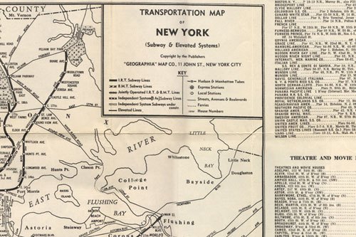
There’s a transit map on the back, but it needs some more work before it gets posted. We’ll save that project for a rainy day, I’ve already put far too much effort into stitching this one together.

Update

Comments also indicate that the map is likely from around the time of the 1939 World’s Fair. I’ve also added a copy of the transportation map on the back. Had scanned it in but forgot to stitch the images together.

Panoramic Map of New York City, Transportation map

Map Back: small | large | flickr

Update 2

From Jim Hughes at Codex 99.

Although the traditional maps were becoming more accurate, the ever-increasing height and sheer density of buildings made perspective mapping increasingly problematic. This map, prepared as a 1939 World’s Fair souvenir by Alexander Gross shows the limitations of traditional perspective.


Truth and the Net

Truth and the Net. Wikipedia gets it wrong all the time. So do bloggers. But then, so do newspapers, magazines, TV and radio. The interesting thing about systems isn’t how they perform when they’re working to specification, it’s what happens when they fail.


Pimp out the Newsfire dock icon

Before and After photo

NewsFire has a slick, stripped-down interface — it’s one of the best looking mac apps out there. Too bad that the dock icon pales in comparison. That said, the internet always provides for your most whimsical fancies.

Enter Denis Radenkovic, who recognized the problem long ago and created a beautiful replacement icon that helps the program stand out in the dock. Visit his site to download the icon package.

There was also a comment offering a new badge colour — something more subtle than the bright green. I grabbed the four pngs out of the package and changed it to the blue. If you don’t feel like doing it yourself, download them from me. To install, just throw them into the package resource directory along with the replacement icon.

Beyond the program’s visual identity, it would be nice to have the ability to rename feeds after you add them. I’m also not a big fan of the floating sidebar behaviour, moving targets are bad. Everyone knows that the dock is a UI nightmare, we don’t need copycats. Other than that, I’ve been quite happy with Newsfire. It’s the first software RSS reader that I’ve stuck with for more than a day or two.


The Tool Pack

Tool Screenshot

The time has come for another pack release (grab the last one if you missed it). And what are these packs exactly? For the most part, they’re a bunch of photoshop templates and a semi-functional WordPress theme. It won’t work out of the box — I call it a learning experience, you might call it lazy.

The Goods

This theme was featured on CSS Import, and people seemed to like it. I liked the graphics but had issues with the structure and bailed on it after a month.

Download the Tool Pack 2.2mb

Notes

I set the backgrounds up oddly, the movement is kind of weird at times. It always bothered me.

The sidebar on the main page is setup to use my asides category, you’ll need to change that number. There are also a number of function calls for plugins that will make it fail.

Both the stylesheet and the screenshot portray the layout with “Lucida Grande” as the body font, that wasn’t always the case. It was originally designed for Arial, and I kind of liked it better that way. I was experimenting towards the end, to each his own.

The Fine Print

Just so we’re clear… there is no support for this package, take it or leave it. There is also no license per se, but that doesn’t mean you can use it for anything. I haven’t made any money off the pack, it wouldn’t be fair if you did. Use it for your personal sites… if you need something professionally, you can do better. The forum might offer some help.


Cory Doctorow ate my crossword

Doctorow as a crossword clue

My conversation with el Cory

Cory Doctorow was in the crossword this weekend, and I had the presence of mind to email him (it’s every kid’s fantasy to be in the crossword).

Me: Dude, you were in the Globe & Mail’s cryptic!
Cory: I’m pretty sure that’s EL Doctorow.
Me: Uh…
Cory: The famous writer?
Me: I hid my brain under a rock. It’s now King of the Centipedes.
Cory: That woulda been hella cool.

Well, the conversation was actually a bit longer, a bit more boring and wasn’t really a conversation at all. My idiocy aside, the answer is IND(EL)ICATE not IND(CORY)ICATE. So, the email exchange helped. The internet is a weird place.


Slow but steady

My trusty old mac is starting to show its age. Nothing terrible, but you notice the odd wheeze as it struggles with a high-resolution slideshow or a large Photoshop comp. That said, it’s hard to complain when the machine is rock solid:

Coronado:~ dkellam$ uptime
16:46 up 61 days, 4:14, 2 users, load averages: 2.76 2.67 2.44

An uptime of 61 days? Guess it’s been a little while since the last reboot. A few specs for the curious: PowerMac G4 933mhz, 1gb SDRAM, 64mb GeForce4MX (my about screen image).


The ungrateful dead

From a recent BBC interview with John Perry Barlow of the Grateful Dead and EFF, concerning Dan Glickman and the MPAA:

I’ve got good news and bad news and good news. And the good news is that you guys have managed to buy every major legislative body on the planet, and the courts are even with you. So you’ve done a great job there and you should congratulate yourself.

But you know the problem is – the bad news is that you’re up against a dedicated foe that is younger and smarter that you are and will be alive when you’re dead. You’re 55 years old and these kids are 17 and they’re just smarter than you. So you’re gonna lose that one.

But the good news is that you guys are mean sons of bitches and you’ve been figuring out ways of ripping off audiences and artists for centuries…..

Welcome to the prolonged media war of attrition. Maybe, the **AA’s should stop suing all of us and hire the odd person under-30.