Massimo Vignelli discusses his approach to book design in a video produced for Mohawk’s “What Will You Make Today?” campaign.
Category: posts
Mariner 1 brought down by hyphen
Mariner 1, a NASA probe, crashed into the ocean not long after takeoff. The cause was a source of confusion for a long time, but seems to have been the result of a missing hypen.
One of the official reports, issued by the Mariner 1 Post-Flight Review Board, concluded that a dropped hyphen in coded computer instructions resulted in incorrect guidance signals being sent to the spacecraft. The review board specifically refers to a “hyphen,” although other sources also refer to an “overbar transcription error” and even to a misplaced decimal point.
Vignelli on the AA logo redesign
American Airlines recently reworked their classic logo. Massimo Vignelli, designer of the original, commented on the the original intention of the design.
Legibility, which is a very important element of an airplane. So we used Helvetica, which was brand new at the time. And we wanted to make one word of American Airlines, half red and half blue. What could be more American than that? And there were no other logos then that were two colors of the same word. We took the space away, made one word, and split it again by color. It looked great. The typeface was great. We proceeded by logic, not emotion. Not trends and fashions.
The first computer art
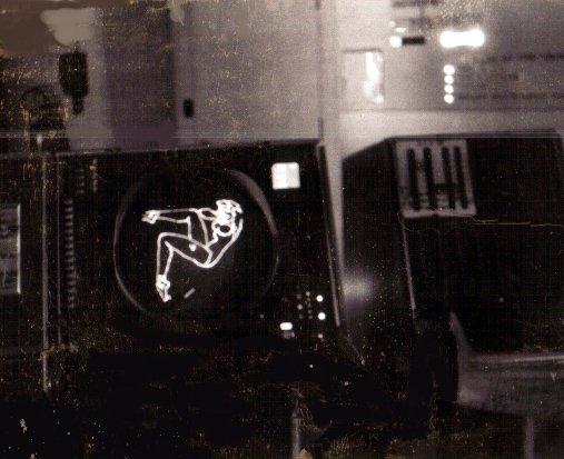
From Benj Edwards at The Atlantic comes the story of the world’s first computer art.
The pin-up image itself was programmed as a series of short lines, or vectors, encoded on a stack of about 97 Hollerith type punched cards, Tipton recalls. Hollerith punched cards were 7.375 x 3.25 inch paper cards that stored binary data via holes cut through a matrix printed on its surface. Like other 1950s computers, the AN/FSQ-7 used the cards extensively for program input.
Update: Some old computer based artwork.
Snowboarding in downtown Montréal
http://vimeo.com/56490557
Canadian snowboarder Sebastien Toutant took advantage of Montreal’s record snowfall with an urban run down Mount Royal (via Devour, hat tip to Shawn Blanc).
A pickpocket’s tale
A New Yorker piece about pickpocket/magician Apollo Robbins by Adam Green.
If a crew of pickpockets is like a football squad, then its star quarterback is the “cannon,” an honorific generally reserved for pickpockets skilled enough to ply their trade without the help of a team. This is also known as “working single o.” Robbins works single o. He is his own steer, stall, shade, and duke man, though, unlike street criminals, he lets his victims know that he will be picking their pockets.
Social media history
Interesting photo set about the history of social media from Daniela Hernandez.
Before Facebook and Facetime and Google+ and Twitter, there was Plato and the Bell Picturephone and the Dynabook and the Xerox LiveBoard. Social media is nothing new. It just has better packaging — and better marketing.
World’s oldest working digital computer

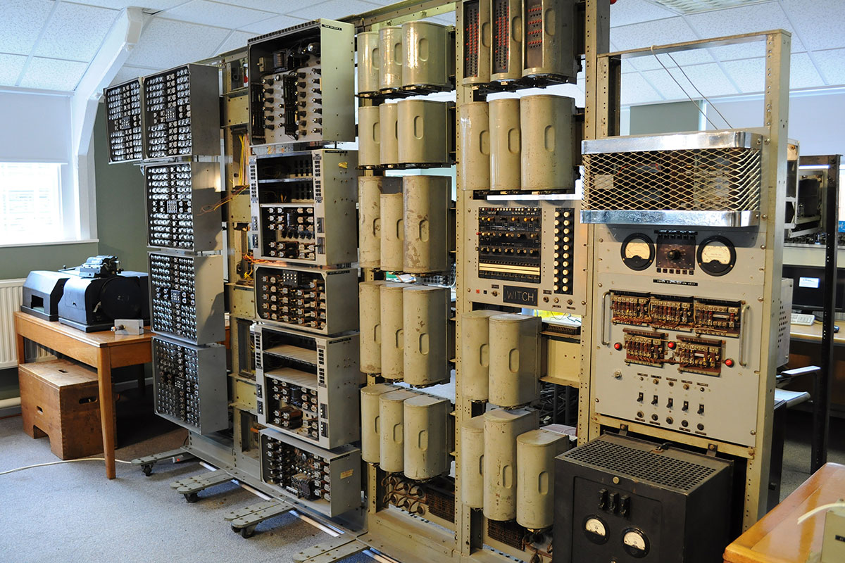
The Harwell Dekatron WITCH has been rebuilt and rebooted at The National Museum of Computing in England, making it the world’s oldest working digital computer.
The 2.5 tonne, 1951 computer from Harwell with its 828 flashing Dekatron valves, 480 relays and a bank of paper tape readers will clatter back into action in the presence of two of the original designers, one of its first users and many others who have admired it at different times during its remarkable history.
If you’re a computer geek and get the chance to visit Bletchley Park, make sure you don’t overlook the museum. I had the opportunity to visit a couple years ago — I had no idea it was there, and probably could’ve devoted another day to it.
How those claw games work
Zach Baker describes how the claw crane arcade games actually work.
Basically, most crane games are designed so the claw is randomly (and only once in many games) strong enough to let players win. Some even weaken in strength after a short time so players get close to victory only to see it slip from their grasp! Since the manuals for many skill games are available online, this is not hard to verify.
I never won anything from one of those games. Then again, I didn’t play them often because they always seemed rigged.
The Making of Goldeneye
Paul Drury on the making of Goldeneye for the Nintendo 64, the game that everyone had.
A key part of that appeal was the infamous Licence to Kill. GoldenEye was a first-person shooter of course, but the decision to recognise body-specific hits introduced a new subtlety to the genre. Shoot a guard in the leg and he reacts differently to if you blasted him in the chest.
I was never terrifically good at first person shooters. Goldeneye was no different, I routinely had my ass handed to me by my little brother. That’s not to say I didn’t have fun playing the game. I loved the proximity mines, one of my few ways to achieve victory; pepper a map and hide in a corner. And there was that ridiculous laser watch.
On video copyright and hints of sanity from executives
If you’re interested in copyright and the current mess of streaming rights, it’s worth reading Why Johnny can’t stream by James Grimmelmann at Ars Technica. That said, there are hints of sanity coming from television executives these days, perhaps a sign that people upstairs are finally getting it.
From Australia, broadcaster ABC will offer Doctor Who for streaming not long after it airs in UK.
“Piracy is wrong, as you are denying someone their rights and income for their intellectual property,” Mr. Dahill said. “The fact that it is happening is indicative that as broadcasters we are not meeting demand for a segment of the population.
“So as broadcasters we need to find convenient ways of making programs available via legal means to discourage the need for piracy.”
I’d like to think his statement was obvious, but it’s taken the better part of a decade for them to catch up with the torrenters.
HBO also appears to be making some inroads in the realm of sanity, bringing streaming only service to part of Europe. I’d like to see how this one plays out first, it could be massively crippled. Given the hoards of people who wants to throw money at HBO for access to content, you have to assume they’re making gobs of money from the cable companies or signed terrible contracts a few years back.
The accidental designer and persuasion
Frances Berriman’s post about being an accidental designer struck a chord with me, particularly the consideration of design as a soft-science:
I unfairly (despite being very much into, and doing, art throughout my life) considered “design” to be a soft subject – engineering being the one with the greater level of difficulty. Wrong assumption, I realise, but easily encouraged during my time with computer scientists during my degree years where the concept of service design for the human-being end of software was treated as a “nice extra” and usually quite glossed over.
My attitude was similar until I had the opportunity to study book design. Web development is a surprisingly similar field to book design; think large quantities of data, tons of images, typography, how the user/reader is interacting with what you made. That experience also made me acutely aware that websites are living things, another point that she touches on:
Those of us building websites then, early adopters of proper web-standards and sites that worked for lots of different kinds of users, tried desperately to make them understand that this isn’t print and it is a flexible, changing, growing, responsive, versatile, medium. They didn’t get it.
I’ve seen the other side of the fence, and like she says, it’s not so much that they don’t get it, more that they have been given the chance to do so. That leads me to a post by Jeff Atwood, But You Did Not Persuade Me. Definitely a skill I need to work on.

