
Yves Peters reports on the ATypI 2010 Keynote presentation in Dublin, featuring Robert Bringhurst. Noted for the using my photograph of The Elements of Typographic Style.
Tag: typography
Helveti.ca
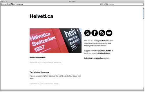
I bought the domain Helveti.ca about four years ago, and had a weblog there for a few months. There was a mixup with hosting, the site was deleted and there was no backup. After languishing for awhile, I revived the site earlier this year and put up a tumblelog.
Obviously, the site is a homage to Helvetica, the ubiquitous typeface created by Max Miedinger & Eduard Hoffman. I try to avoid posting anything that just happens to use Helvetica. Opting instead for artwork, articles, videos, etc. that directly reference the typeface in one form or another.
Stop by and have a look around. Subscribe to the RSS feed or follow @helveticablog on Twitter to keep up to date.
Typographer’s Glossary

The Typographer’s Glossary from FontShop provides definitions of all the type terms that you wanted to know, but were afraid to ask. Their education section provides a handy PDF of the glossary, as well as a number of other documents to aide in your typographic pursuits.
The origins of abc
Ever wanted to know where our alphabet came from? Read The origins of abc from iLT.
That story spans some 5,000 years. We’ll travel vast distances, meet an emperor, a clever Yorkshireman, a Phoenician princess by the name of Jezebel, and the ‘purple people’; we’ll march across deserts and fertile plains, and sail across oceans. We will begin where civilisation began, meander through the Middle Ages, race through the Renaissance, and in doing so discover where our alphabet originated, how and why it evolved, and why, for example, an A looks, well, like an A.
An excellent read, with a great layout for the web, and a collage from Able Parris to boot.
Matthew Carter interview
Here’s a short interview with Matthew Carter, for the Boston Globe, by Liza Weisstuch. In the video Carter mentions that he has designed more than 70 typeface families, including Georgia and Verdana.
Ligature, Loop & Stem print

The Lesson Plan Print from Ligature, Loop & Stem is a thing of beauty. Unfortunately, it’s sold out already. Head over to FontFont for a writeup about the piece and a brief interview with one of the creators, Grant Hutchinson.
Neue Helvetica Arabic designed by Nadina Chahine for Linotype.
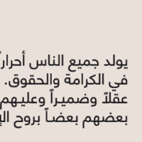
Neue Helvetica Arabic designed by Nadina Chahine for Linotype.
8 Faces magazine

My copy of Elliot Jay Stocks’ new magazine, 8 Faces, just arrived in the post this morning. I was lucky enough to snag a copy during the short period before it sold out. Given the nature of the online typography community, I had a feeling the limited print run would be snapped up in short order. There is still a pdf available for purchase if you’re interested.
The magazine is devoted to typography, asking eight leading designers which typefaces they would use if they were limited to just eight for the rest of their lifetime. It features interviews with Erik Spiekermann, Jessica Hische, Ian Coyle, Jason Santa Maria, Jos Buivenga, Jon Tan and Bruce Willen & Nolen Strals. It also features an introduction by John Boardley and artwork by Able Parris (available for download).
I’ve had the pdf sitting around for a couple weeks, but have avoided reading it, because I wanted to see the magazine in print first. Can’t say that I’m disappointed for waiting, there’s been a lot of care and effort put into it. Elliot has written an article about his experiences with getting it published. The magazine is gorgeous and I’m looking forward to sitting down and reading the entire thing.
Typefaces of the decade
Paul Shaw picks the ten typefaces of the decade.
It is not a list of my favorite typefaces, nor is it a list of the most popular typefaces. Instead, it is a list of typefaces that have been “important†for one reason or another. However, I am not going to provide my reasons. Instead, I am going to let the readers of this blog see if they can figure out the contribution that each of these ten faces makes. This list is not definitive. It is only a suggestion. There are several other typefaces I reluctantly jettisoned because I wanted to keep the list small.
As with any such list, there are bound to be those who agree and disagree with the typefaces. He provides the rationale for each of his choices in one of the comments.
I am not a big fan of a number of faces on my list–some I detest and others I just find ugly–which is why it is not a list about popularity or about aesthetics but about something more elusive. There is a bias in my list toward typefaces that are functional, experimental or somehow the “firstâ€.
Combining Type With Helvetica. Our first guest is Indra Kupferschmid,
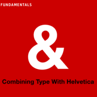
Combining Type With Helvetica.
Our first guest is Indra Kupferschmid, a German typographer and writer who lives in Bonn and teaches in Saarbrücken at the French border. As co-author of “Helvetica forever”, Indra is often asked what typeface to combine with the world’s most famous font. As Indra puts it, “Helvetica is often described as the tasteless white rice among typefaces: satisfies easily, cheap and fast. But the good thing is, you can take the design into different directions with the sauce and side dishes (the typefaces you pair with Helvetica).”
Google type
Typekit and Google have teamed up to create the open-source WebFont Loader. The software can make use of Typekit’s extensive library, Google’s new collection of webfonts or it can be self-hosted.
Writing systems of the world
The Beauty of Typography: Writing Systems and Calligraphy of the World. An extensive introduction to a number of non-Western writing systems.