

Month: October 2010
The Phenomenon, a life-changing fitness machine from Rob Keller.

The Phenomenon, a life-changing fitness machine from Rob Keller.
Helvetica in Windows 1.0
A press release for Windows 1.0. It appears to have included Helvetica as a font.
Finishing Touches
For Hoefler & Frere-Jones, it’s all about the sweating the small stuff. While developing Gotham, they noticed that the fractional one appeared naked and needed a serif. So, they decided to add it to all of the other fractions.
It’s something that we added because we felt it mattered. Even if it helped only a small number of designers solve a subtle and esoteric problem, we couldn’t rest knowing that an unsettling typographic moment might otherwise lie in wait. We’ve always believed that a good typeface is the product of thousands of decisions like these.
That’s called attention to detail.
Typographic Maps
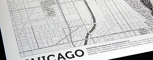
Axis Maps has released a Typographic Maps art project, which accurately depicts the physical features of the cities using nothing but type. So far, they’ve only created maps of Boston and Chicago, but I imagine there will be more down the road. Their blog entry has a few additional details about the process, including the fact that they were created through manual tracing and adjustment, nothing automated.
New post: Typographic Maps http://8face.com/x/1
New post: Typographic Maps http://8face.com/x/1
Does anyone particularly object to…
Does anyone particularly object to getting links to recent posts on eightface.com in the twitter stream?
Sorry for the repeat posts,…
Sorry for the repeat posts, just trying to Lessn and Twitter Tools playing nicely together, involved a bit of code hacking.
New post: Finishing Touches http://8face.com/x/2
New post: Finishing Touches http://8face.com/x/2
The Simpsons and Banksy
The recent episode of the The Simpsons featured a couch-gag from Banksy. The New York Times has an interview with Al Jean explaining the “button-pushing” and offering some details about the opening. For those of us not in the US, poke around the internet a bit, you should be able to find a copy of the video. The Guardian also has a description of the intro.
Map of Online Communities

Randall from xkcd has posted an updated version of the Map of Online Communities for 2010. It’s also available full size for extra goodness.
ATypI 2010 Keynote
Yves Peters reports on the ATypI 2010 Keynote presentation in Dublin, featuring Robert Bringhurst. Noted for the using my photograph of The Elements of Typographic Style.