Interface Overload

Derek Punsalan examines the interface choices available in a selection of washing machines, or as he puts it, not going into orbit, just looking for clean clothes. We’re a long way removed from the relative simplicity of the old machines, although one of their added features involved losing an arm. Innovation isn’t just about incremental improvements and greater safety, it means more features, more buttons and more blinky lights.

Interface Overload

The article reminded me of an exam question in a human-computer interaction course that I took years ago. We were asked to describe the best user interfaces that we had encountered. I chose to describe the space-heater in my room, it was great. The machine had one button, one switch and a few LEDs. You pressed the button to turn it on. The LEDs indicated the current temperature, and you pressed the button again to cycle through them. The switch on the base allowed the heater to rotate. After moving to an exceedingly hot top-floor apartment, I no longer needed the heater. So, I lent it to a friend’s housemate, who decided to dry clothes on the wee thing. It blew up. Although she was lacking in the brain department, the girl still has all of her limbs.

I’m still a fan of minimal hardware interfaces, with Apple handhelds being the obvious example. Another one of my favourites are the basic CrockPot models — one switch with three settings (off, high, low). Although, they’ve tried to muck things up with all manner of digital crap. But that’s progress.


Too stupid to cook

Michael Ruhlman writes that with all of the prepackaged food and simple recipes in a box that are available, people start to believe that they’re too stupid to cook. He goes on to outline the world’s most difficult roasted chicken recipe, which I’ve reproduced.

Turn your oven on high (450 if you have ventilation, 425 if not). Coat a 3 or 4 pound chicken with coarse kosher salt so that you have an appealing crust of salt (a tablespoon or so). Put the chicken in a pan, stick a lemon or some onion or any fruit or vegetable you have on hand into the cavity. Put the chicken in the oven. Go away for an hour. Watch some TV, play with the kids, read, have a cocktail, have sex. When an hour has passed, take the chicken out of the oven and put it on the stove top or on a trivet for 15 more minutes. Finito.

After you’ve finished with the chicken, you can throw the carcass in a pot (with a touch of vinegar to make the meat fall of the bone), add some carrots, celery, onion and salt, simmer it, and you’re left with stock. Then make some delicious soup.


Pony kids

Pony tied to a pole

Alanah visited the Smithfield Horse Market in Dublin yesterday and took a few photos. I’d never heard of Dublin’s pony kids before, but messing around with horses is apparently somewhat of a tradition for young knackers.

In a city blighted by drugs, the horses certainly provide an important form of escape for bored youngsters who might otherwise take to heroin and petty crime.

Here’s another excerpt, from an older article in The Independant.

The suburban horse culture is a fascinating example of what happens when the poor appropriate the pleasures of the rich. In Ireland, horse ownership is generally the prerogative of farmers and of the wealthy business and professional class. Quite how it became fashionable among the children of the urban dispossessed is not entirely clear.

It’s an interesting outlet for young people, and probably wouldn’t have cropped up in any other city. The main problem is that many of the kids live in housing estates, so there’s no proper stable to house the horses. The inability to properly look after the animals has resulted in poorly treated, malnourished horses wandering around and grazing at the side of the road.

Attempts have been made to shut down the horse fair, but they’ve been unsuccessful. The event has been occurring for more than a hundred years, and there’s no real organization — people know that it happens on the first Sunday of every month, and they show up with horses in tow.


Happy ninth

Ninth Birthday

Time to celebrate! The weblog is nine years old. It actually started on an old ISP with a tilde address, and migrated to eightface a few months later. Kind of hard to believe that it’s been around for about a third of my lifetime. I never had any sort of long-term plan — at the time it just seemed really cool that you could use blogger to update your site from any browser, rather than having to rely on FTP.

In other news, I’ll be starting a live redesign in the near future, it’s been awhile since I’ve done one. I liked the collage graphics in the most recent layout, but it bothers me that one of the main elements was the Morton Salt girl. Being Canadian, I had no idea that she was part of an iconic American brand. At the time, I was going for an early 1950s vibe, and it was just one image among many. Another reason for a redesign is that the overall look just doesn’t suit what I’m posting, the typography is a bit too serious. Nine years of posting has also produced a lot of legacy issues. I need to start going through my old posts to clean things up (tag the old entries, add titles and whatnot), before things get really out of hand.


Free Font Index

Free Font Index

Last year, I was contacted by Hans Lijklema about including my fonts in an archive of free fonts. His Free Font Index landed on my doorstep a couple weeks ago. I just got around to posting some photos now, there are some better spread shots over at The Fell Types.

What fonts you say? About ten years ago, I went on a font making kick, mostly hand-drawn stuff, and crappy erasure remixes. Some of them were drawn by my buddy Brian Stuparyk. People still download and use these in various projects, you can grab them here. They’re pretty rough and raw, no kerning, no nothing… didn’t really know what I was doing at the time. I should probably revisited the fonts and clean them up a bit.

If you get the chance, you should check out the book. There’s some great work in there by talented type designers, who created much more usable typefaces. There are also some cool interviews.


flickrRSS 5.0

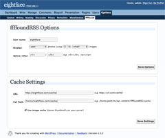
It’s time to release a new version of flickrRSS. It’s actually been largely complete for the last three or four months, but I was waiting for the new version of WordPress to come out, and then just got lazy about rewriting the documentation. Much of the credit for this release goes to Stefano Verna, who cleaned up the source code, reworked some existing features, and added some new ones.

This is a major release, we’ve tried to make it as backwards compatible as possible, but it will likely break for some people. Here’s a quick run down of the major new features and changes:

  • New presentation logic with metatags
  • Revamped parameters system using arrays
  • Settings panel hides features that aren’t being used
  • Separated core plugin code from the settings panel

With the new presentation and parameters, it should allow you to customize the output a lot more. There’s probably room to add a few more meta tags, but it’s a good start. The system makes it easier to use things like Lightbox, although you’ll probably be breaking Flickr’s terms of use. Hiding unused features in the setup panel should make things a little bit easier for some people. The separation of code is mostly targeted at developers who reuse the code for other systems.

I’m pushing this out on the site first, before rolling it out in the automatic WordPress update system. Ideally, that will allows use to catch any unforeseen bugs before they become a major problem. The plugin should import your old settings without any trouble, but it’s possible that you may need to do the setup again (particularly widget users).

If you run into problems, please post on the new flickrRSS forum, I was running into a lot of spam problems with the old one.


My Year in Cities, 2008

Making it’s now annual appearance, here’s a roughly chronological list of the places that I visited during the past year.

  • Toronto, ON, Canada*
  • Mississauga, ON, Canada*
  • Brockville, ON, Canada*
  • Montreal, PQ, Canada*
  • Ottawa, ON, Canada
  • Burlington, ON, Canada*
  • Waterdown, ON, Canada
  • Belfast, Northern Ireland*
  • Dublin, Ireland
  • Glasgow, Scotland

One or more nights were spent in each of the cities listed. Places with an * were visited multiple times on non-consecutive nights. Not quite as many place as last year, but it’s a reasonable list overall.


From the Archive: Drudge Report Parody

In a recent post at Signal vs Noise, Jason Fried argued that the Drudge Report is on of the best designed sites on the internet. I’m inclined to agree, not because it’s an amazing layout or well-coded, but because it’s iconic. His post made me a remember a parody of the site that I worked on around the time of the 2004 presidential election.

For those that don’t know, I used to work for a humour newspaper in university, called Golden Words (whose website appears to be non-functional). The newspaper is widely read, with a circulation of about 9000 copies every Wednesday morning, and could be roughly equated to The Onion or the Harvard Lampoon.

After a turn at the helm as editor in my final year, I returned periodically to make sure things were sailing along smoothly. Around the time of the US elections in 2004, I stopped by to see if the new crew could use some help. I was tasked with creating something for the back page, which was typically full colour and devoted to some sort of graphical mayhem or illustrated comic.

The Drudge Report’s iconic layout, and room for small photos and one-liners provided the framework for a quick and dirty send-up of the site. If I remember correctly, Alanah and I spent about two or three hours producing this parody of the Drudge Report for the 2004 Presedential election. It appeared on the back page of the paper around Hallowe’en, hence the zombie references. The line about Bush supporting fiscal responsibility is oddly prescient.


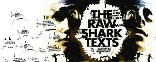
Raw Shark Texts

The Raw Shark Texts by Steven Hall

I recently chewed through a copy of The Raw Shark Texts by Steven Hall. The first night, I didn’t want to put it down, but ended up succumbing to the need for sleep. It’s an odd sort of book that straddles multiple genres, with elements of sci-fi, romance and philosophy to name a few. To a large extent, it’s left up to the reader to determine what sort of book that they want to read. I don’t want to give away too much, but it’s kind of like tossing The Matrix, Memento and Jaws, into a blender and chugging it down.

The official website and alternate reality game offer up the sort of viral marketing which is normally reserved for movies and videogames. Can’t say that these campaigns do much for me, but it may serve to pique your interest. For those that have already read the book, there is a wiki and a forum, if you’ve still got questions.

On a side note, it it probably would’ve been a fun book to design. It’s not incredibly complex, but does offer a little bit more flair than you’d normally see in a trade paperback.