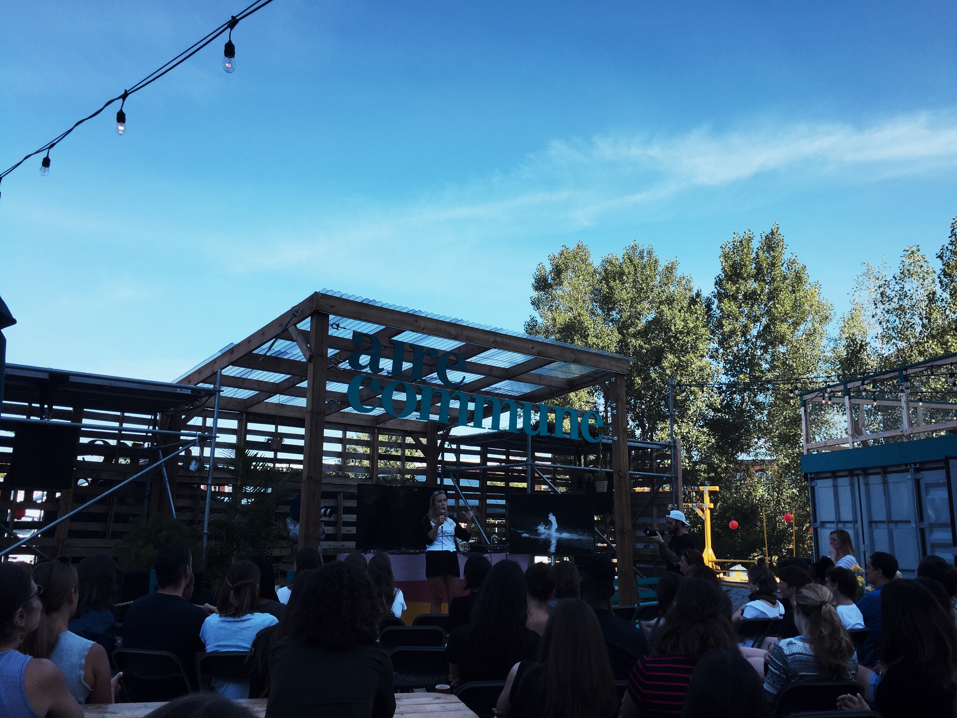
Creative Mornings with Lea Vinson at the awesome Aire Commune space in Mile End
I make things on the internet
Creative Mornings with Lea Vinson at the awesome Aire Commune space in Mile End

I joined the dev team at Plank this week ??

Design Canada is a documentary film celebrating the golden era of Canadian design. View the trailer.
I attended the Montreal screening of the film last week and definitely learned a few things. My design history knowledge skews heavily towards Britain and Europe, so it was pretty awesome to see Canadian efforts in the spotlight. I grew up during the period when much of this work was being scrapped in favour of the new, so I never really appreciated some of the systems that we had in place.
The film is showing around the country over the next month, including several more screenings at Cinema du Parc in Montreal. It will be released digitally in the fall.
Thanks to the film’s director, Greg Durrell, for providing me with the film’s title card for this post.
Creative Mornings Montreal 5th anniversary at Station F-MR along the canal

Ordered some of these orange chairs from Article earlier in the year. The colour makes me happy. They’re also surprisingly comfortable.

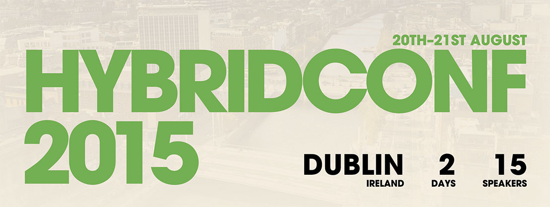
I went to the first HybridConf in Cardiff two years ago, and will definitely in Dublin for the third and final iteration this year (couldn’t make it last year due to family commitments). The first one was awesome; the speakers were great, the events were awesome, and I met a lot of incredible people. If you need convincing, here’s an excerpt from the convince your boss guide (relevant even if you’re your own boss):
Our original remit was about bringing designers and developers together, and that is still very much a part of it, but we’ve transformed and grown to become a conference that is welcoming and appropriate for everyone who works in our industry and loves to create things.
We are a conference where attendees will gain knowledge about so many important aspects of work, from teamwork and communication, to strategy and organisation, to examples of what fantastic things we can achieve in the world with the tools we have available to us now.
If you’re in the vicinity of Dublin on Aug 20th, you should really pick up tickets. If you’re not in the vicinity and haven’t planned a vacation, making it pseudo work related for a tax write-off isn’t a bad idea.
Zach and Laura are two of the most awesome people I’ve met, and I know that they absolutely pour their hearts into this project. That sort of effort has its toll though, and is probably the main reason this will be the last HybridConf. I’ll be there, hope to see you there too!
Update: I ended up giving a pocket talk at the conference. Check out the video:
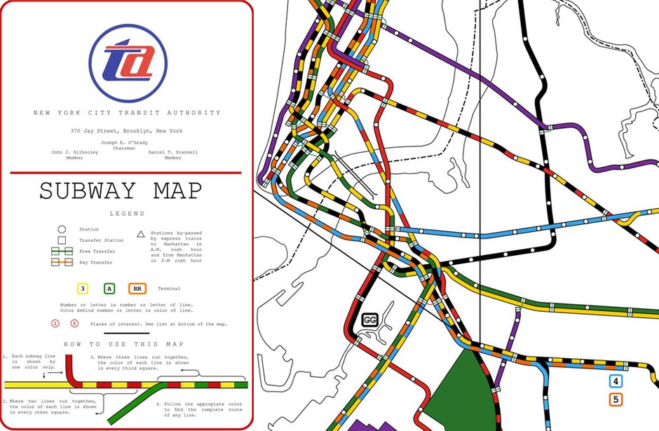
A version of the NYC subway map, which had been lost to history, was recently found and recreated digitally by Reka Komoli.
A local lawyer, R. Raleigh D’Adamo, was the winner of that 1964 contest. His design separated local from express routes and assigned separate colors to each of them. Submissions had to fit all the subway lines into a geographically correct map. So to use as little space as possible, D’Adamo employed colored squares along shared lines.
Personally, I would’ve found the map tough to use as a tourist, none of the station names are indicated. It was replaced by Massimo Vignelli’s version three years later.
For all my creative friends who’ve struggled at times trying to achieve their dreams, an artice from Sara Benincasa, Real Artists Have Day Jobs.
Have you ever dreamt of being a real artist?
Have you ever wondered what it would be like to call yourself a real painter, or a real writer, or a real actress, or a real musician?
Have you ever described yourself as someone who does something amazing and magical and wonderful and life-affirming and then added “on the side”?
Well, you might not like what I have to say.
Because I have come here today to deliver the unfortunate truth that you are lying to yourself.
You are not going to become a real artist one day.
You are a real artist right now.
Go read the rest.

Charles Ying wrote an article for TechCrunch detailing Flipboard’s automated approach to layout with their new Duplo engine.
Ultimately, what we’ve done with Pages and Duplo is take the elements of magazine layout design — a powerful tool in framing a story and its impact on the reader — and created a way to automate the process, while still capturing the essence and art of a human designer’s craft.
There’s some pretty cool stuff going on under the hood, including adding a degree of randomness to the layouts, so you don’t get the same layouts over and over again.
From Dan Edwards in response to overly harsh design critics dickheads, Educate don’t humiliate:
As a general rule we should try better to understand why the designer has made the decisions they’ve made and think about their experience and how we can help, not just humiliate them. Take the time to provide newbies with the resources and answers that they need. That’s education.
Especially pointed given how easy it is to offer a knee-jerk reaction on the internet. Of course, I’ve never done anything like that.
The same notes could be applied to developers too. It’s easy to become dismissive of someone’s work because they did it in an unfashionable language, or a different coding style, or used some sort of kludgy hack. There was likely a reason behind the decision, which may be worth examining before picking up the pitchfork.
Updated: Upon further reflection, they should not be called design critics (we’ll go with Dan’s original intent). Also, forgot to link to actual article.
Anatomy of a Logo: Star Wars takes a look at the evolution of the iconic logo.
“I’d been reading a book the night before the meeting with George Lucas,” she says, “a book about German type design and the historical origins of some of the popular typefaces used today—how they developed into what we see and use in the present.” After Lucas described the kind of visual element he was seeking, “I returned to the office and used what I reckoned to be the most ‘fascist’ typeface I could think of: Helvetica Black.”
Inspired by the typeface, Rice developed a hand-drawn logo that translated well to the poster campaign, and ultimately to the movie itself. “I did have the screen in mind when I drew the logo originally,” explains Rice, who “stacked and squared” the words to better fit the brochure cover. It was an aesthetic choice that has lasted nearly three decades.
Massimo Vignelli discusses his approach to book design in a video produced for Mohawk’s “What Will You Make Today?” campaign.