Swanky.org archives

Swanky inspired illustration

It’s possible that we may see work from the old Swanky and Swankarmy crew — the old archives have been found. From a tweet by Dustin Vannatter:

I found a series of 20+ CDs that contain a fs dump of all Oh, Hello projects inc Scribble.nu and Swanky.org .. going to try to restore it.

Swanky was one of the first design communities on the internet in the late nineties. They were heavily inspired by the work of David Carson; a lot of grunge and distorted typography. It wouldn’t be a stretch to say that it was an influence on a huge number of designers. Scribble was a journal site, a sort of precursor to weblogs.

I found the scene in 1998 when it was beginning to implode. Still, Swanky was one of the reasons I started getting interested design. It also led to my discovery of typography and the creation of a bunch of crappy typefaces, before realizing that it took a lot of effort to make a good one. I was never a member of Swanky, but ended up forming Suffocate.org with a number of ex-members. We had themed issues and a number of side-projects — including the Conform Project, which was similar to Layer Tennis. Most of my Suffocate work is lost, but I found some of the early Conform series in an old archive, and posted them a few years back.

I’d love to see the old Swanky stuff, brings back a lot of memories. As for Scribble, I don’t know if the world needs my high-school ramblings, but it could be an interesting historical archive.


One space after a period

Despite whatever you’ve been told in the past, you should only put one space after a period, not two.

Is this arbitrary? Sure it is. But so are a lot of our conventions for writing. It’s arbitrary that we write shop instead of shoppe, or phone instead of fone, or that we use ! to emphasize a sentence rather than %. We adopted these standards because practitioners of publishing—writers, editors, typographers, and others—settled on them after decades of experience. Among their rules was that we should use one space after a period instead of two—so that’s how we should do it.

In my high-school typing class, we were working on ancient ICON computers which used monospace type, and were told to leave two spaces after a period for readability. I then spent years developing muscle-memory that had me double-tapping the spacebar after every full-stop. In university, I started writing for one of the newspapers and got yelled at for putting in double spaces and messing up the copy-setting — I learned quick. Fast-forward to book design, and given any sort of manuscript, getting rid of the double spaces is one of the first priorities. Remember, just one space.


Time-lapse book cover design

A two minute time-lapse video of a book cover being designed. Lauren Panepinto, the creative director of Orbit Books, lets you see the process behind creating the cover for Blameless by Gail Carriger. You can read Laura’s blog post about the video to glean a few more details about the process.

Over 6 hours of my onscreen compositing, retouching, color correction, type obsessing, all condensed down to a slim sexy one minute 55 seconds of cover design. Trust me, no one wants to watch it in real-time.

Lastly, design:related has a few more details about the cover, including one of the early comps from the series.


8 Faces magazine

8 Faces in the wild

My copy of Elliot Jay Stocks’ new magazine, 8 Faces, just arrived in the post this morning. I was lucky enough to snag a copy during the short period before it sold out. Given the nature of the online typography community, I had a feeling the limited print run would be snapped up in short order. There is still a pdf available for purchase if you’re interested.

The magazine is devoted to typography, asking eight leading designers which typefaces they would use if they were limited to just eight for the rest of their lifetime. It features interviews with Erik Spiekermann, Jessica Hische, Ian Coyle, Jason Santa Maria, Jos Buivenga, Jon Tan and Bruce Willen & Nolen Strals. It also features an introduction by John Boardley and artwork by Able Parris (available for download).

I’ve had the pdf sitting around for a couple weeks, but have avoided reading it, because I wanted to see the magazine in print first. Can’t say that I’m disappointed for waiting, there’s been a lot of care and effort put into it. Elliot has written an article about his experiences with getting it published. The magazine is gorgeous and I’m looking forward to sitting down and reading the entire thing.


Interface Overload

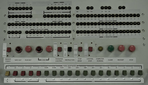
Derek Punsalan examines the interface choices available in a selection of washing machines, or as he puts it, not going into orbit, just looking for clean clothes. We’re a long way removed from the relative simplicity of the old machines, although one of their added features involved losing an arm. Innovation isn’t just about incremental improvements and greater safety, it means more features, more buttons and more blinky lights.
Interface Overload

The article reminded me of an exam question in a human-computer interaction course that I took years ago. We were asked to describe the best user interfaces that we had encountered. I chose to describe the space-heater in my room, it was great. The machine had one button, one switch and a few LEDs. You pressed the button to turn it on. The LEDs indicated the current temperature, and you pressed the button again to cycle through them. The switch on the base allowed the heater to rotate. After moving to an exceedingly hot top-floor apartment, I no longer needed the heater. So, I lent it to a friend’s housemate, who decided to dry clothes on the wee thing. It blew up. Although she was lacking in the brain department, the girl still has all of her limbs.

I’m still a fan of minimal hardware interfaces, with Apple handhelds being the obvious example. Another one of my favourites are the basic CrockPot models — one switch with three settings (off, high, low). Although, they’ve tried to muck things up with all manner of digital crap. But that’s progress.


On teaching design in Mozambique

From an interview with designer Barbara Alves about teaching in Mozambique.

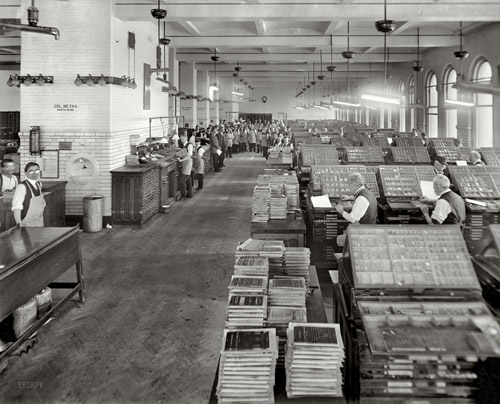
For example, students in the graphic design course asked me to give them lessons in color, insisting they knew nothing about it. This really surprised me. My immediate answer was, “But you should teach me! You’re surrounded by color and use it in such powerful ways in every aspect of daily life. I admire you for it!” Their response was to laugh and say, “But Teacher! That’s not design! We need to use design colors.” From talking to my students and people in the cultural sector, I got the impression that design was this distant, quite artificial, field they had to adapt to.