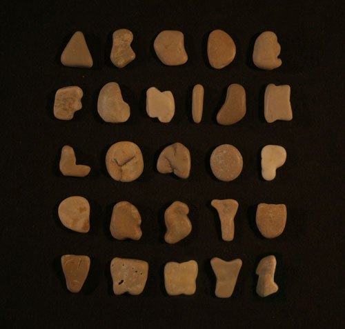
Lorenz Fidel Huchthausen sent me an email awhile ago with a photo of Stein, a typeface that he created using stones collected from Croatia.
I make things on the internet

Lorenz Fidel Huchthausen sent me an email awhile ago with a photo of Stein, a typeface that he created using stones collected from Croatia.
See examples of Fonts In Use. The site takes a look at various web and print sources, and examines which typefaces are used. You can also narrow the results down to a specific font and see samples of it in action. File this one away for inspiration.
Rosetta is a new independent type foundry created by David Březina, José Scaglione and Veronika Burian. They are focused on creating multi-script typefaces that are technically sound and aesthetically pleasing.
One of the main objectives of the foundry is to create a retail library of high-quality typefaces that are respectful of the traditions and cultural background behind each of the supported scripts. Rosetta actively promotes team-work and collaboration between designers, consultants and language specialists.
Two studies, by Princeton psychologists, have found that using a hard-to-read font can lead to improved memory performance. They compared the retention of material set in Monotype Corsiva, Comic Sans Italicized and Haettenschweiler versus the same material set in Helvetica and Arial. From the research paper published in Cognition:
This study demonstrated that student retention of material across a wide range of subjects (science and humanities classes) and difficulty levels (regular, Honors and Advanced Placement) can be significantly improved in naturalistic settings by presenting reading material in a format that is slightly harder to read.
Fluency interventions are extremely cost-effective, and font manipulations could be easily integrated into new printed and electronic educational materials at no additional cost to teachers, school systems, or distributors. Moreover, fluency interventions do not require curriculum reform or interfere with teachers’ classroom management or teaching styles.
I doubt that textbooks are in any danger of being typeset in crappy typefaces, but there’s probably some room for typeface variation that could improve learning. This technique is probably more relevant for handouts and classroom materials provided by teachers.

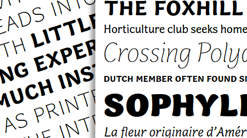
Presenting a wonderful new typeface from Alice Savoie, entitled Capucine, available exclusively from Process Type Foundry. The typeface is available in both traditional format and for use on the web.
Capucine defies traditional categorization, it sits in a genre we are drawn to as users of type: a face with distinct personality able to straddle the worlds of both text and display with ease.
I had the honour of knowing both Alice and Nicole Dotin (from Process Type) in my year at Reading and love that Capucine has finally reached a publication point. Capucine looked beautiful three years ago, but I imagine the perfectionist in Alice wanted everything to be just right. Congrats to both Alice and Process Type on the release. I look forward to using the typeface at some point in the near future.

Titillium is an open typographic font and the subject of a didactic course project at Accademia di Belle Arti di Urbino.
The aim of the project is the creation of a collective fonts released under OFL to be promoted and shared through a web platform. Each academic year, a dozen of students are working on the project developing and solving problems. The type designers interested in the amendment or revision of Titillium are invited to cooperate or develop their own variants.

The Standpoint Gallery in London is having a letterpress exhibition during the next month or so. The exhibit, curated by Graham Bignell of New North Press and Richard Ardagh, will showcase how the printing technique is being reinvented for modern times.
Reverting to Type aims to highlight the pioneers at the helm of the current resurgence of interest in letterpress; from computer-based designers with a desire to ply a craft with a tactile immediacy that has been lost with moderntechnology, to traditional presses finding a new way to revitalise their design output.
This is definitely on the list of things to do during my last couple of weeks in England. See this pdf release for more details about the show, including the final list of contributors.

In the early twentieth century, there were medicines to cure everything that ailed you. Many of them contained lots of alcohol, or a variety of opioids and other random root extracts. Hard to know if the medicines were effective or if the users were just drugged out and couldn’t feel any pain. Regardless, they lived in a time of gorgeous typographically oriented packaging.
The Great Typekit Table helps you find a good Typekit font for long blocks of text. The table also lets you know if there are extra weights, opticals and how it renders in Windows.
Awesome Fontstacks helps create a bundle of matching, free web fonts with failsafe fallbacks, ready to drop into your CSS.

H-57 has a created a few Star Wars posters illustrated with typography. The poster also details the typeface that each glyph came from.
Update: Boba Fett in type via @marchodges.
For Hoefler & Frere-Jones, it’s all about the sweating the small stuff. While developing Gotham, they noticed that the fractional one appeared naked and needed a serif. So, they decided to add it to all of the other fractions.
It’s something that we added because we felt it mattered. Even if it helped only a small number of designers solve a subtle and esoteric problem, we couldn’t rest knowing that an unsettling typographic moment might otherwise lie in wait. We’ve always believed that a good typeface is the product of thousands of decisions like these.
That’s called attention to detail.

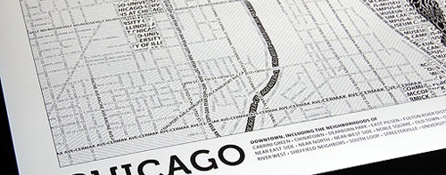
Axis Maps has released a Typographic Maps art project, which accurately depicts the physical features of the cities using nothing but type. So far, they’ve only created maps of Boston and Chicago, but I imagine there will be more down the road. Their blog entry has a few additional details about the process, including the fact that they were created through manual tracing and adjustment, nothing automated.